查看完整案例


收藏

下载
年轮蛋糕源于德国,后风靡日本,其酷似年轮的外形,让人联想起岁月更迭、情意不变的美好寓意。
Baumkuchen originated in Germany and then was very popular in Japan. Its shape resembles a tree ring,which reminds us that although time pass by, the wonderful feelings have never changed.
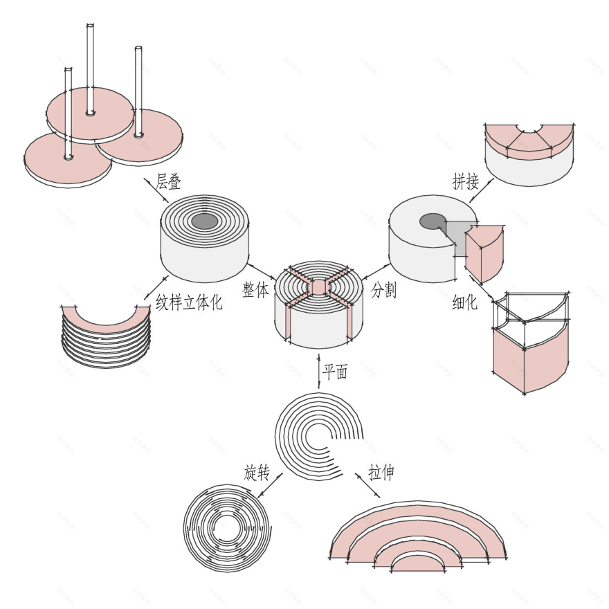
为了能在店铺设计里表达品牌文化,我们结合了年轮蛋糕的特点和品牌logo, 使“年轮”的元素贯穿于整个空间。
In order to express the brand culture in the store design, we combine the characteristics of the Baumkuchen and the brand logo, so that the elements of the “annual ring” run through the entire space.
本次的空间设计从年轮蛋糕的特征出发,旨在将“年轮”的元素融入空间中,表达出特有的形式。两家蛋糕店分别位于不同的商场综合体内。
The space design is in terms of the characteristics of Baumkuchen and aims at integrating the element of “growth rings” into space with the peculiar form. The two stores are located in different shopping centers.
荟聚店 Store (in Wuxi LIVAT Centre)——平面立体化
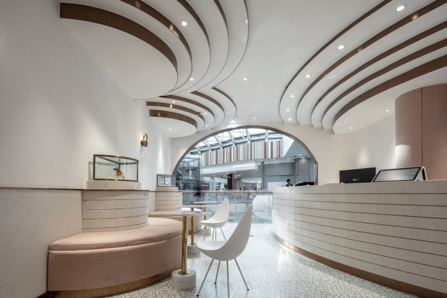
荟聚店位于商场的四楼,经营面积60平方,结构是较为方正的矩形。此商场的消费人群相对年轻,所以我们在本店的表现形式上做了些调整。
This Store is located on the fourth floor of Wuxi LIVAT Centre. It is a rectangular space with a business area of 60 sq.m.. The consumer groups here are mainly young people, so we make some adjustments in expressions of the store.
立面弧形的线条贯穿于空间内,顶面的造型与功能设置相呼应。
Three-dimensional curved lines interspersed throughout the space.The shape of the top surface corresponds to the function of the area.
粉色的装饰面给空间带来了一些活泼的气质。
The pink decoration makes atmosphere of the whole space lively.
海岸城店Store ( in Coastal City )——立体平面化
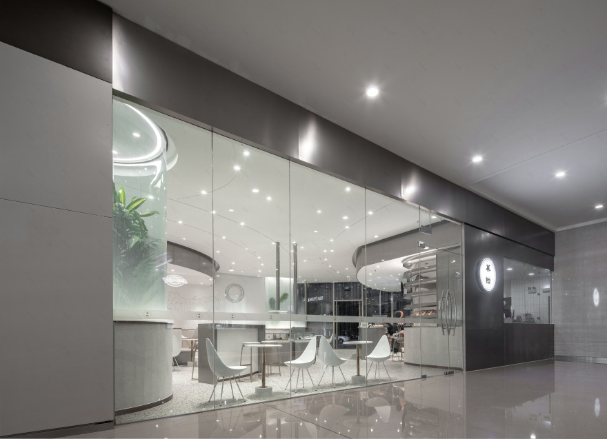
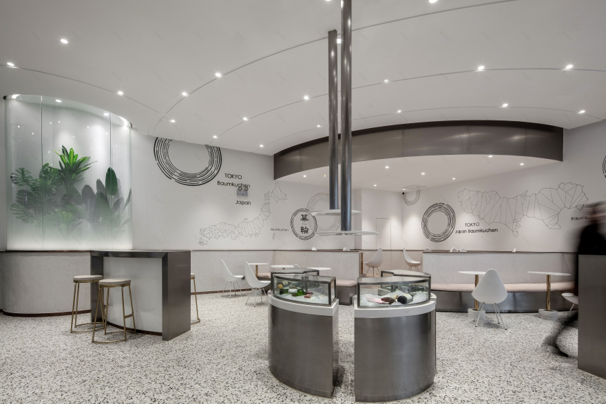
海岸城店位于商场一楼的沿街商铺,营业面积较大,主要由服务区,展示区和座位区三部分组成。
This store is located in the street shop on the first floor of the shopping mall. It consists of service area, display area and dining area. The business area is about 160 square meters.
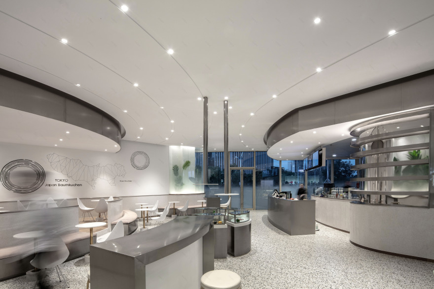
空间布局呈不规则形,我们设计了(服务区和座位区)两个扇形区域分别放在了相对的角落,自然形成的中间区域用来做展示区。
Due to the irregular layout of the store, in 2 opposite corners we designed 2 sectoral areas as service area and dining area, and the display area is in the middle of them.
空间造型与平面布局相呼应,不同层次的弧形体块穿插于间,满足各自的功能需求。
The spatial shape and the horizontal layout correspond to each other, and the curved blocks of different levels are interspersed in the space to meet their respective functional requirements.
材质方面,大量使用不锈钢作为主要材料,配浅色墙地面,用水磨石的灰度将大块面上的层次拉开;天花和地面的关系形成呼应,宛如落座在蛋糕间。
In terms of the use of materials, we use stainless steel as the main material, with light-colored walls and floors, and then use a gray terrazzo to create hierarchical sense. At the same time, the relationship between the ceiling and the ground forms a response, just like you sitting in the cake room.
为了让承重柱消解在空间形式内,我们依柱体边缘做展台展架、加植物、点光源,用渐变贴膜玻璃将原有结构融化于空间中。
In order to integrate the load-bearing column with the space, we used a gradient film to process the glass and the plants and point light to decorate space between the column and glass. And at the same time, we designed a booth display along the edge of the column.
▲Logo
▲纸袋
甜点之于人,是小时候的眉开眼笑,是青春年少的怦然心动,更是成年人们的幸福港湾,而人生中所有的这一切甘苦,希望都有人在场,与你分享。
What the dessert is to us, is the laughter in childhood, the true passion in youth and the happy harbor of adults. However, each of us sincerely hopes that someone will share all the joys and sorrows of life with you.
项目信息——
项目名称:幕轮·年轮蛋糕
设计方:无锡本墨视觉设计有限公司
完成年份:2018.10
主创及设计团队: 张书山,王凯,蔡忱
项目地址:无锡滨湖区海岸城B座一楼/无锡锡山区云竹路荟聚购物中心4楼
建筑面积:海岸城店:160平米/荟聚店:65平米
摄影版权:陈铭
合作方:之几美学(陈设)
客服
消息
收藏
下载
最近


