查看完整案例


收藏

下载
改造后的永康路185号
185 Yongkang Rd. after renovation
永康路185号,前身是一个60平米的路边餐馆。18年11月接到委托,第一次现场考察时,除了当时有些吓人的卫生状况,场地本身并未给我们留下特别深刻的印象,唯一的直观感受是:这块场地狭长、纵深,咖啡馆餐厅这类需要大量家具的业态不合适,最好的可能性是展厅或者画廊,中间留白,营造一个通透的空间,才能让人自在舒服。
185 Yongkang Road formerly was a 60-square-meter street dinner. During our first site visit in November 2018, our impression was that the site is long and narrow, due to this constrains, business like restaurant or café which requires a lot furniture may not work, the best potential for this space is probably an art gallery or showroom.
改造前的永康路185号
185 Yongkang Rd. before renovation
12月,业主正式确定业态为中古家居展厅,冥冥之中场地用途和当初的直觉不谋而合。展厅名为「Single Person」,有趣的是,业主其实是一对合伙人,而OFFHAND恰巧也是二人合伙。
In December, client decided to use this venue for a vintage houseware gallery, named ‘Single Person’. Stochastically, this decision is coincided with our early intuition. Interestingly enough, client is actually a musician duo, and OFFHAND happens to be a two-person partnership.
Single Person 店铺卡片
Single Person store card
设计初期的沟通阶段,业主直接给了我们两百多张参考图片,希望借此直观表达自己的喜好。对于这些图片,我们的使用方法是,不借用其中的具体意象,而是通过它们来理解业主的审美。通过排除法,我们很快确定了项目的边界。另一方面,业主的参考图片不成体系,驳杂零散,更像一个Mood Board。
为了和业主的参考形成对比,系统性和整体性,成为了我们在设计伊始的第一个切入点。直觉中适合做展厅的狭长空间,在这一步开始被真正分剖解析。现场遗留的承重结构将整个空间基本均分成四个独立区域,我们能做的,是将业主的展品种类与各个区域一一对应,整合出一个完整、合理但又不刻意的设计方案。
During the initial communication phase, client directly sent us more than two hundred reference images to express their aesthetic preference. All those images are trivial and scattered, showing different possible design directions.
In order for us to kick start with the design, systematic and design coherent became the key. It was at this stage that the space was thoroughly analyzed. The existing structural walls divide this long and narrow space into four individual rooms. What we did is to categories different products with each area and integrate client’s needs with a straightforward solution to develop a comprehensive plan.
平面图
PLAN
1 中央展厅
centre gallery
2 侧廊
side gallery
3 连接走廊
corridor gallery
4 出口展厅
exit gallery
剖面图
ELEVATION
一个狭长空间,只在两端出入口有光源。这不正是一个洞穴吗?CAVE(洞穴)这个词,在我们寻求定义空间整体性的时候,第一次闯进了脑海中。而因为空间与洞穴在物理形态上的诸多相似之处,我们在验证概念的过程中,越发认识到这是场地自身属性所彰显的,而非我们强加的概念,它有现实的物理基础,是真实成立的。
确定了“洞穴”这个整体概念之后,系统逻辑也就自然生成了。我们开始对洞穴、洞穴建筑、以及洞穴风格进行调研,并结合场地的自身特点和功能需求,进行设计细节的深化。
A narrow space with light sources only at both ends, isn’t this a cave? The word CAVE broke into our mind when we first sought to define the space as a whole. And because of the space shares similar physicality with cave, while we were verifying this concept, we realised that CAVE is not an imposed concept but manifested by the nature of the site itself. It is found on its physical reality. It is a true argument.
Once the overall concept CAVE was established, other design elements for this space that shares the same design language naturally fall into place. We researched cave itself and cave related design, developed design details with functional requirement and the site’s own specific conditions in mind.
概念草图
Concept sketch
出口展厅及其顶部天窗
Exit gallery and skylight
天窗细节
Skylight detail
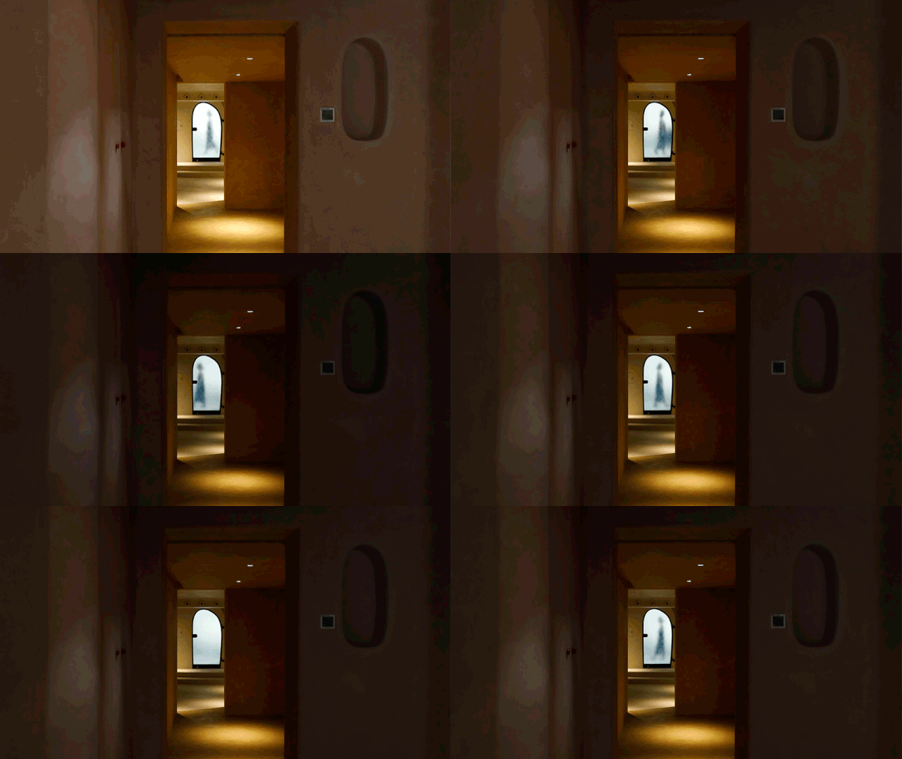
场地的第一个特点(也可说问题)是光源太少。我们在中央展厅开凿了一排壁龛,来弥补室内光线的不足。侧廊由于面积窄小又与中央展厅毗邻,我们直接打穿墙壁,将两个空间通过一个不规则的窗洞贯通。连接走廊有多个璧龛,出口展厅则是开了一列天窗。‘凿壁取光’的设计贯穿了整个空间。在“洞穴”这一整体概念下,天窗被给予充足的纵向深度,以模拟光线穿过厚厚的洞穴墙壁投射进来的样子。光源的指引,让每一个进入空间的人走到这里时,都有一种出洞的错觉。通过控制光的进入方式,我们将洞穴的体验进一步强化和放大。
The first site constrains (also can be viewed as a feature) is that lack of natural lighting in the inner space. In this case, openings on walls are applied throughout the entire space to create indirect lighting sources. A row of small niches was created along the wall of centre gallery, to bring out a candle lighting ambience in the space. An irregular peeking window is punctured for visual connection between centre gallery and side gallery. As for the exit gallery, a row of skylight is designed to guide the visitors out of the cave. Under CAVE concept, the skylight is given a great vertical depth to simulate the way light penetrates through thick cave walls. By controlling the way light enters, it magnified the experience of a cave.
场地的另一个特点,是有明显的空间层级关系。从剖面图上可以很清晰地看到室内每一个展厅的高低落差。在不能改变原有土建的基础上,我们决定利用空间之间的落差,来进一步强调洞穴的纵深感和层级递进关系。地面和台阶的颜色,成为了两个空间之间渗透渐变的产物。而中央展厅的台阶,被处理为一个弧形展示台,是为了响应业主提出的有一个独立展台的需求。
Another feature of the site is the spatial hierarchy. As showing in elevation, each room is placed on different level. Since the original civil structure cannot be changed, we decided to take advantage of the height difference between each space, to highlight the depth and progressive level of a cave. Flooring colour that is continued on steps thrusted into the adjacent space, thus created an infiltration gradient between two areas. The curve platform in the centre gallery is in response to the client's request for an independent merchandise stand.
连接走廊与出口展厅之间的台阶
Stairs between the corridor and the exit gallery
在此基础上我们想到了通过颜色来分割空间,以明度深浅来递进纵深的做法。我们将第一进的中央展厅和侧廊统一为亮度最高的白垩色,将第二进的连接走廊处理为明暗度居中的土黄色,而最后的出口展厅,为最深的赭石色。色彩选取大地色系,是“洞穴”这一逻辑概念下的系统产物。明度一层比一层深,则是为了表示深入洞穴后光线减弱空间变暗这一洞穴的物理特点。
Apart from using height difference to indicate space, different shades of colour is applied to show further emphasis on the depth. First area which including centre gallery and side gallery is in white enamel. Second area, the corridor gallery is in ochre with darker shade, while the last area, the exit gallery is in sienna, the darkest shade of all. Using earthy colour is a natural inclination under the concept of CAVE. The lightness of shades is to indicate the physical attributes of the cave, where the light is dimmed, and the space is darkened after going deep into the cave.
空间里的每个橱柜把手,也是我们趁着旅行,在柏林的跳蚤市场精心挑选的像小石头一样的古董陶瓷把手。
Every cabinet handle in the space is carefully selected at a flea market in Berlin. We occasionally collecting interesting materials for our projects while traveling. These peddle shaped antique ceramic handles is a joyful found.
对于洗手台水龙头,一开始并没有头绪,不知道怎样的龙头才能融入空间。后来团队设计师从SketchUp模型库里无意中发现了一个特别适合的品牌Jee-O。调研后发现最近的代理商在香港,于是开始了跟代理商漫长的邮件沟通。当然,水龙头运抵装上的那一刻,一切的辛苦都是值得的。
For the faucet, there was no clue at the beginning, we were not sure what kind of faucet could match the space. Fortunately, our designer stumbled on a brand called Jee-O from the SketchUp warehouse. We found out that the nearest supplier is in Hong Kong, then a long and lengthy communication process with the supplier had begun. When the faucet finally installed, all the hard work is paid off.
材质与肌理,一直是OFFHAND热爱探索和实验的领域。因此我们会在施工细节上倾注大量的精力和时间。空间的三个颜色确定后,我们希望每个空间的涂料肌理有所区别,好让人每进入一层空间,都能有新的细微发现。感谢我们遇上了跟我们一样较真,甚至更有死磕精神的业主,我们一起打样了四十七块涂料版。
Material and texture have always been the area where OFFHAND keen to explore and experiment, therefore, we often devote a great deal of time and effort into the construction details. Besides colour, paint texture is also varied in each room to bring subtle contrast in spatial experience. Thanks to our client who is as stubborn as we are, together we made totally 47 paint samples.
打样过的部分材料样板
Some p
aint samples we made during prototype process
最得意的当属门洞。是我们心目中一个洞穴入口该有的样子。外立面的剖面圆弧细节,连施工方都为之骄傲,甚至拿出手机拍照留念。除了弧度,外立面的肌理选择也有用心。晃眼一看似乎很像法租界建筑常见的“拉毛灰”,但肌理幅度更收敛,也因此让“洞穴”在毗邻建筑中不会显得过于突兀。
The entrance is built very close to the cave entrance we have imagined. Our contractor is so proud of the arc of the façade, he even took a selfie with it. The texture of façade looks similar to stucco but is actually a result of pebble wash.
Single Person可以说是一个和业主共同完成的项目。比如连接走廊的壁龛,业主提出可否做一个迷宫一样的璧龛,并画了一张草图。我们在SketchUp中将草图画出来摆着玩,结果发现圆弧的细节和展厅意外地契合,当即决定直接使用这个形状。对于一个自发生长的洞穴而言,随着越来越多圆弧形态的加⼊,我们很自然地将展厅的各个面的节点,都处理为了弧线。碍于施工水平,并非每一处都达到了设计预期,但中央展厅墙壁和天花板的转角细节还是令我们欣喜而满意的。
Single Person is a cooperative effort with client. The maze niche of corridor gallery is made directly out of client’s sketch. So does the irregular window in the centre gallery. As more oval shaped details were added in the space, we gradually changed all wall intersections detail to curves. Due to construction constrains, not everything executed perfectly, but the intersection detail between walls and ceilings in the centre gallery are rather satisfying.
业主草图和连接走廊璧龛
Client sketch and corridor gallery niche
OFFHAND作为一个室内设计团队,并不强求前置的设计理念,而是针对每个项目每个场地的实际问题,提出解决方案。对于我们来说,并没有某种一定要实现的美学主张,空间不仅仅是一个形式,一个艺术作品,我们更感兴趣的是空间和人的关系。空间作为一个活动的场域,和人有哪些互动的可能。重要的不是空间本身,而是人在空间中会有什么样的切身感受。今天的我们,和过去的人对空间的需求是不同的,这也正是建筑设计让我们着迷的地方,我们总是在解决的,一直是此时此刻的问题。
“洞穴”这个项目中,概念诞生自场地的物理局限。这让我们意识到,真正的概念实际是从解决场地问题的过程中浮现而出的,而非刻意强加的。如果这个空间本身确实和一个很强的概念产生了共鸣,为何不大胆拥抱呢?
As an interior design practice, OFFHAND do not impose design concept, but aim to solve realistic problems of diverse sites of different projects. We are interested in the relationship between space and people. Space as an energy field for interaction, and how to reveal the potential that it innates. This has been a key subject that we study and examine through our practice. The understanding of space varies among generations, therefore the problem we are solving is forever a problem that is happening, evolving and changing. This is where architecture fascinates us.
Through this CAVE project, the concept is formed due to its physical restraints. This made us realise that a true concept should emerges from the process of problem solving, not pre-assumed or imposed. If a site has manifested a concept by itself, why not embrace it?
客户:Single Person
地点:上海市徐汇区永康路185号
室内面积:60m²
项目设计时间:2018.11-2019.03
项目施工时间:2019.03-2019.07
设计内容:建筑外立面,室内,灯光
室内建筑设计:OFFHAND PRACTICE
设计团队:袁愿,聂璇,李月
设计协调:李熙慧
空间摄影师:高忆青
VI设计:Cynde
设计施工团队:上海佑特装饰设计工程有限公司
艺术涂料与微水泥供应商:上海蕴澄实业有限公司
天然石材供应商:BELLE STONE
WEIBO/INSTAGRAM:offhandpractice
Single Person预约渠道:
特别鸣谢:撰文与平面设计 Cynde
o f f h a n d p r a c t i c e . c o m


