查看完整案例


收藏

下载
秩序的平衡
建筑与基地间应当有着某种经验上的链接,一种形而上的联系,一种诗意的联结。
--------steven holl
▲
场地与周边环境的原始情况
建筑
、、、、、
白塔山下的白房子
项目场地位于衢州常山县城白塔公园山脚下,属于老翻新。原先业态设计已有年份,
在当地已相当名气,
是当地休闲人群的主要核心去处。不过
装修已不符合当代年轻时尚的消费场所,
业主希望通过这次改造设计,全新升级产品,为消费者带来更有意思的消费体验。我们再思考如何保留原有消费群体的下,开发新的年轻时尚的消费群体。
The project site is located at the foot of Baita Park in Changshan County, Quzhou, and is an old renovation. The original format design has been around for a few years, and it has become quite famous in the local area and is the main center of the local leisure crowd. However, the decoration is no longer in line with contemporary young and fashionable consumer places. The owner hopes that through this renovation design, brand new upgraded products will bring consumers a more interesting consumer experience. We then think about how to retain the original consumer groups and develop new young and fashionable consumer groups.
▲
新外立面与周边的和谐关系
在梳理设计的思路时,分析当地的消费情况,以及在地性的置入文化性的设计思考,当我们第一次考察项目看到山上一座在当地具有悠久历史的白塔时,联系到了白塔山下的白房子概念,山上具有浓郁的植被覆盖,在油绿的背景下,白房子显得尤为安静和现代,不争不抢刚刚好。
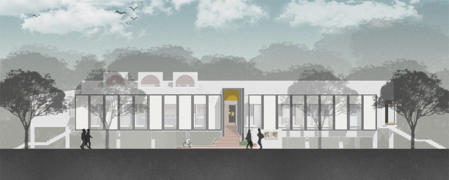
房子的最大弊端是过于冗长,导致服务动线太长,极不合理,因此在调整外立面时把主入口位置重新移位。立面处理是整个改造工程的重点,矩阵式的分成若干个对话框组合,远观仿佛是钢琴上跳动的音符,在打破
狭长的立面
的单调,同时结合夜晚灯柱达到富有节奏的效果。
The biggest drawback of the house is that it is too long, resulting in too long service lines, which is extremely unreasonable. Therefore, the main entrance position was re-shifted when adjusting the facade. Facade treatment is the focus of the entire renovation project. The matrix is divided into a number of dialog boxes. From a distance, it is like hitting the keys of music on the piano. It breaks the monotony of the long and narrow façade, and at the same time combines the night lampposts to achieve rhythm. Effect.
▲
植物与外立面若隐若现
▲
富有仪式感的入口大门
室内
、、、、、
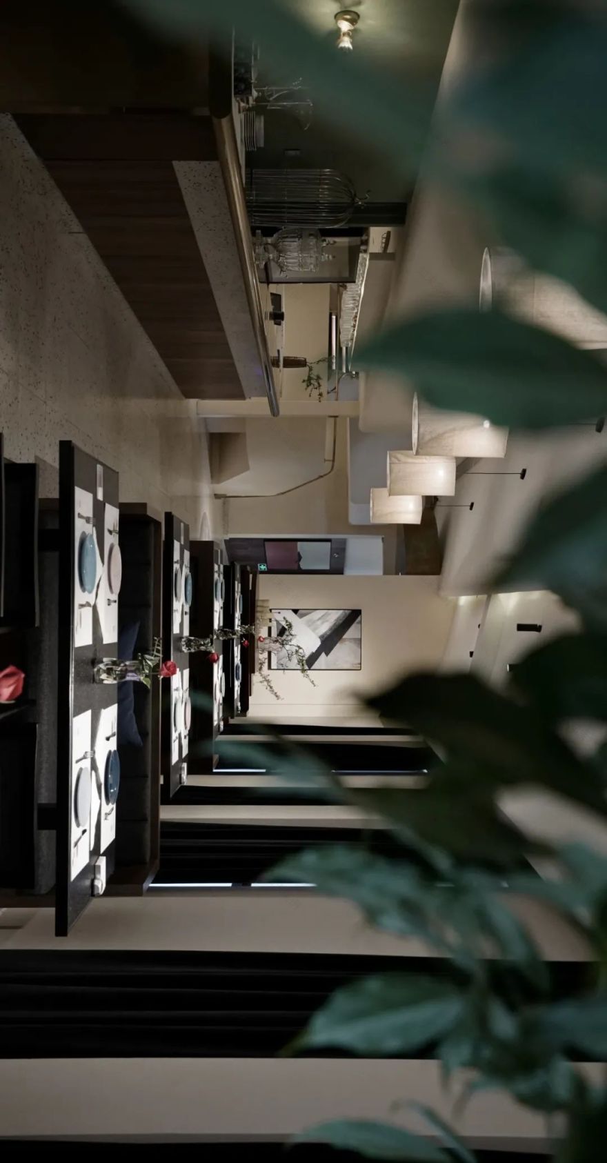
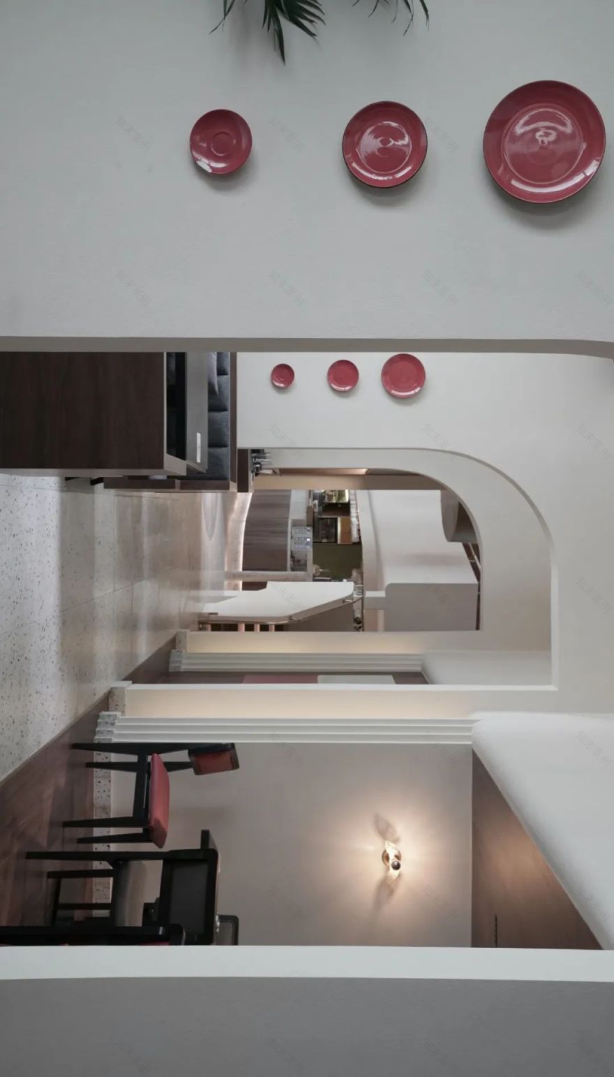
室内是基于业态调整分为就餐区及酒吧区,就餐区大厅的营造希望视觉上有餐吧的感觉,复合就餐和下午茶的氛围。整个结构利用建筑的层高关系,不同模块形成之间穿插和错落的丰富层次,运用教堂里拱形元素形成柔和的线条,同时让用餐者在不同切片间交流。我们希望这些场景能帮助客人们休闲用餐,并沉浸在音乐里的气氛中,沉浸在一个陌生又新奇的空间里。
The interior is divided into a dining area and a bar area based on the adjustment of the industry status. The creation of the dining area hall hopes to have a visual sense of a dining bar, with a layout of compound dining and afternoon tea. The entire structure utilizes the relationship between the building's storey heights, and different modules form a rich layer of interspersed and misplaced elements. The arched elements in the church are used to form soft lines, while allowing the placers to communicate between different slices. We hope that these scenes can help guests relax and immerse themselves in the atmosphere of music, in a strange and novel space.
▲
U型弧面的水吧台
▲
用餐大厅
▲
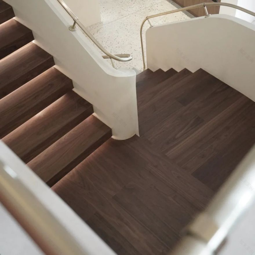
楼梯扶手细节
▲
咖啡厅模式
▲
工地现场
▲
轴立面分析
▲
平面分析图
WATER TEAM DESIGN
////////
建筑 / 室内 / 视觉
Architecture/ Interior/ Graphic
///////////////////
欢迎分享至朋友圈
Welcome to share to friends
////////////////////////
营造生活空间气质美学
Creating a temperament space aesthetics
////////////////////////
//////////
Reproduced paease specify Water team deign,Rights reserved.
客服
消息
收藏
下载
最近


